 Charts are effective visual tools for presenting information, summarizing results, and revealing trends and patterns in data. The Chart Portlet is the one-stop solution for all your data visualization needs! It offers maximum flexibility through a range of configuration and customization options and an intuitive user-friendly interface that makes it easy to generate and display a variety of charts anywhere on the Liferay portal.
Developed by Savoir-faire Linux’s Liferay team, the Chart Portlet is written using Vaadin 7 to be deployed on any Liferay server. It currently supports English, French and Russian.
Highly configurable, this portlet allows you to choose from different data source types including relational databases via JDBC, Groovy scripts, REST web services with JSON or XML, and CSV files; first enter the details of the data source from which you wish to obtain a certain data set and produce a chart. You can then choose the type of chart to present the data from a variety of available charts including the pie chart, donut chart, bar chart, column chart, line chart, area chart and gauge chart.
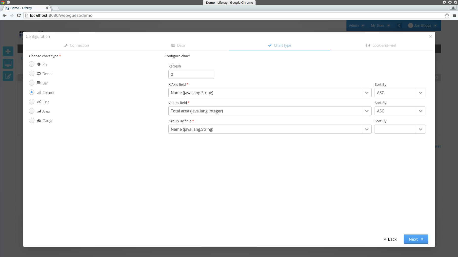
After choosing the type of chart, you can configure the fields of the chart, e.g. the axes or labels, and you can specify a sort order for some of the fields. Furthermore, you can add a Refresh time in the configuration to ensure that the chart gets refreshed at regular intervals and thus always reflects the latest data. You can preview the chart that is generated and customize its colors before saving it. Upon saving, the finalized chart gets published on the portal but can still be configured at any time for modifications.
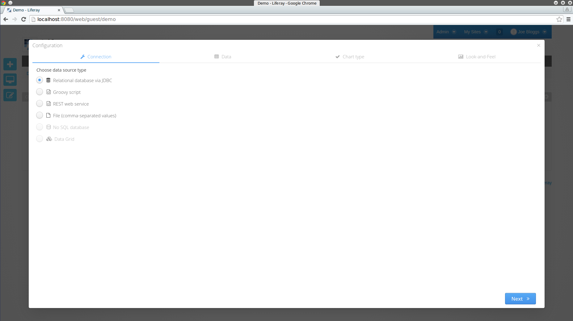
After deploying the Chart Portlet to your server, you will be able to add it as an application anywhere on your portal. Initially, the portlet requires some configuring before it can display any chart. In the first step of the configuration, you will be able to choose from a list of possible data source types supported by the portlet:
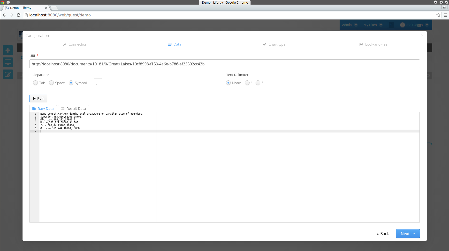
In the second step of the configuration, you will be able to fetch the data from the data source of your choosing.
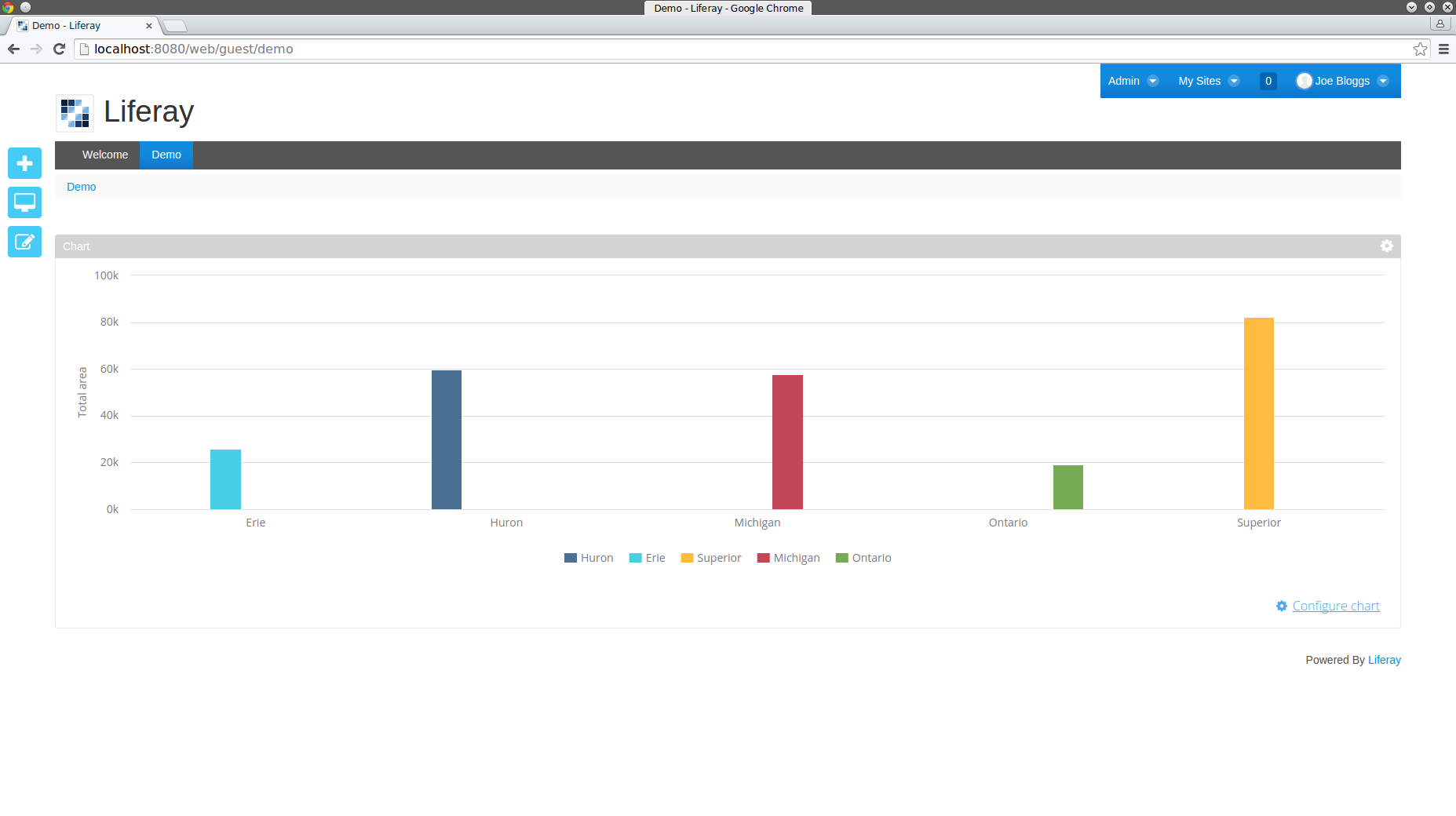
Say you wish to display the total area of each of the Great Lakes in a visually compelling manner on your portal from a simple CSV file that contains the name, length, maximum depth, and total area of the Great Lakes. First, select File as your data source type. In the second step of the configuration, paste the URL of the CSV file. You can link to any CSV file of Open Data on the web but for this example assume the CSV file has been uploaded to your server. Select the Separator and Text Delimiter values that correspond to the file and click on Run to view the resulting data:
The next step of the configuration contains a list of possible chart types supported by the portlet: pie, donut, bar, column, line, area and gauge. Continuing this quick example, choose the chart type as Column. Configure the fields of the column chart, specifying the total area in the Values field.
The final step of the configuration allows you to preview the chart and customize its Look and Feel. Save the chart when you are satisfied with the way it looks, and it will be displayed on your portal:
Detailed examples are described in the following tutorials: